Humabuilt
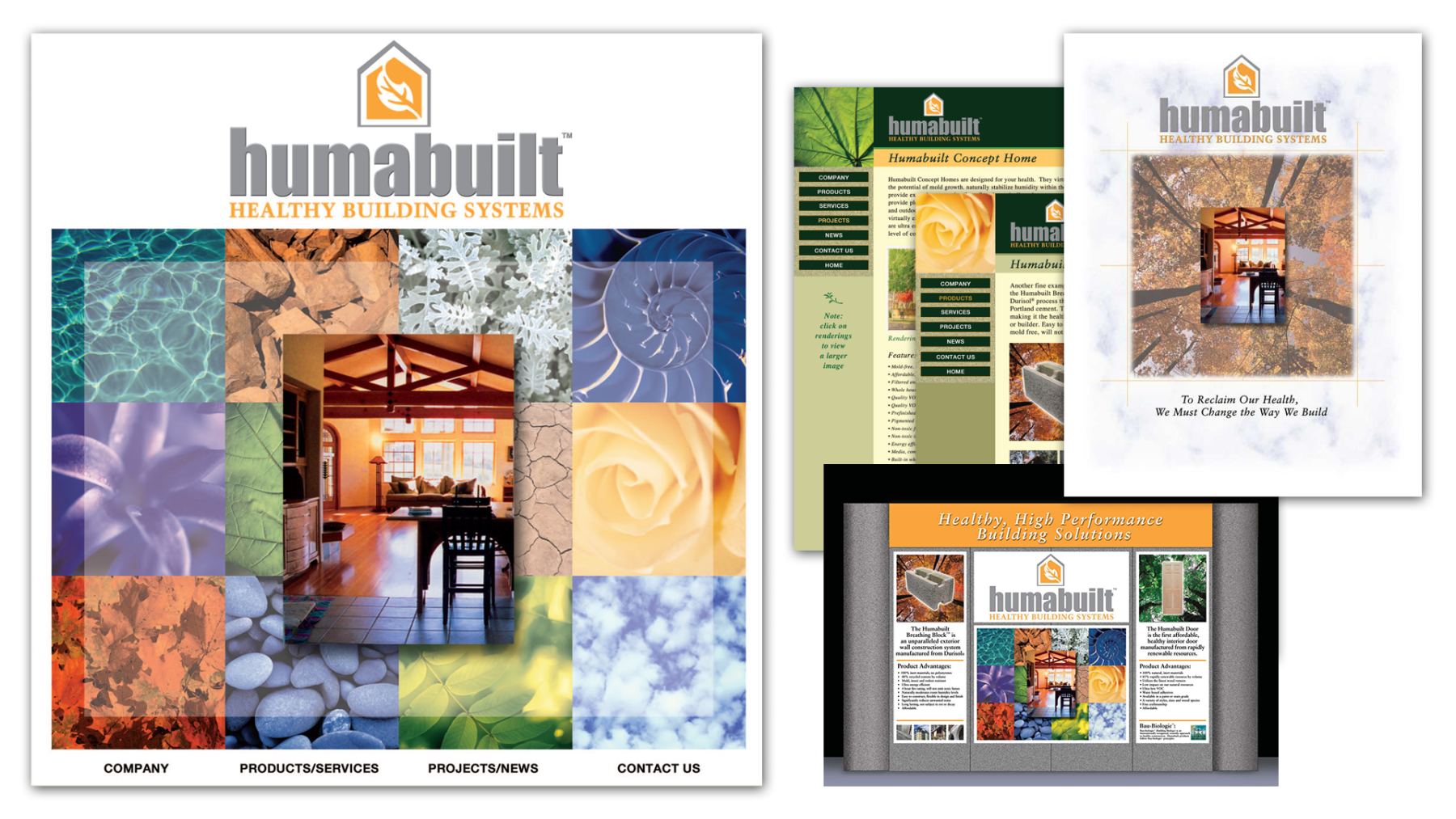
Develop a complete corporate identity program and graphic package for this startup company, which included the brand name, logo, stationery, marketing material, exhibition booth, and website. The designs convey building systems that help to eliminate health risks associated with conventional building techniques and materials.
We opted to emphasize the name with a bold font to imply strength and stability. Among the various interpretations of the word ‘huma,” one definition of “hu” signifies spirit, while “mah” suggests water. Together, they represent healthy natural elements. Also, the mythical Huma bird is said to live its entire life flying high above the earth, never alighting on the ground. The symbol is centered, floating above the name. Within the shape of a house is a rising airstream, shaped as a leaf. “Huma” also stands for human. Because this was a green company, we avoided the obvious choice of in colors. Instead, we chose the color yellow for the interior of the house to imply warmth, evoking yellow flames in a fireplace warming a home.
Stated by the client in a letter to us: “We couldn’t be happier with the results. Crawshaw Design’s ability to translate our ideas into creative, artistic content made the entire project a pleasure. Crawshaw Design delivers a premium product, a great value and superior customer satisfaction.”