Flying Colors
Develop a brand identity upgrade for a San Francisco general contractor specializing in interior and exterior renovation and painting.
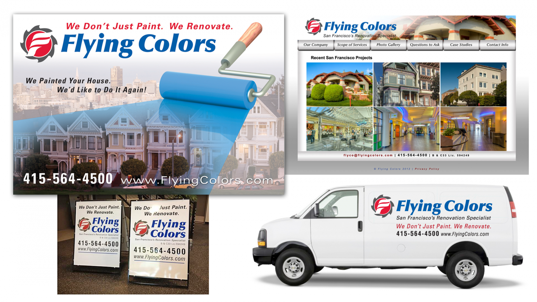
As an expression of the company name, Flying Colors, the logo was designed to signify motion and color. Red, white, and blue are its primary colors. The symbol features a stylized letter “F” to suggest both a windblown flag and paint brush, which merges into the background element — an opened can of red paint with saw blades as its perimeter, graphically stating the dual aspects of the company’s business. To reinforce this visual message, we added the descriptor tagline “We Don’t Just Paint. We Renovate.”
The client immediately noticed an increase in business and attributed this growth in new customers to its new brand identity, specifically seen advertised on their company vehicles, construction banners, and signage, as well as on its marketing materials and its website.