Visual Communications Technology
A Brief History
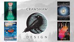
Crawshaw Design was established in 1975 as a San Francisco graphic design firm, creating corporate identity programs, brochures, annual reports, ads, mailers, signage, and other forms of printed marketing materials. With the advent of the digital age — causing both a revolution and a revelation in our industry — we evolved, incorporating technological advances into our business practices and entered new venues. And we have been riding the wave of escalating innovation ever since.
With our background in print design and knowing what works in this media, our expansion into the internet arena has been a natural progression. It has augmented our ability to navigate creatively in this virtual marketplace. We understand the integrated necessity and symbiotic relationship between print and the web.
Why We’re Unique
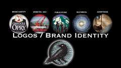
By choice, we are a small firm, yet we work with an array of creative partners and recruit other professionals when needed, depending on the scope of a job and the specific requirements of a project. This helps us stay competitive. We also work in conjunction with other agencies. Case in point, while partnering with MFP Consulting, we created the new logo and branding identity for the Grand Ole Opry, an American icon and the home of country music in Nashville. As well, we designed the corporate identity for First Tennessee / First Horizon, one of the nation’s 50 largest bank holding companies in asset size and market capitalization. In other words, we respect the creative process and work well with others to get the job done right.
With more than 30 years’ experience, we can assure our clients that the products and the services we provide — from creating a website to rebranding an entire corporation — will produce the desired results. We work closely with our clients to understand their needs and objectives. With an integrated approach, we apply three distinct methods of expertise to all our designs: strategy, creativity, and technology. By applying these key elements to every project, we are able to effectively deliver innovative solutions and satisfaction.
Our clients come from a variety of industries, including healthcare, banking, retail, engineering, architecture, law, publishing, broadcasting, hospitality, and technology. Our work has appeared in trade publications and books. We are a member of the Executives Association of San Francisco and the San Rafael Chamber of Commerce, and we are an active supporter of the community.
Why a Crow?
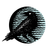
“Crawshaw” is an English name that combines the root words “craw” and “shaw.” One interpretation, derived from The Compact Edition of the Oxford English Dictionary, is “crow from the edge of the woods.” Therefore, a crow symbol was our goal for the company brand. The final design is a modern approach that combines line art with a simulated handcrafted woodcut carving, creating an homage to English pub signs. The crow, with its head turned back revealing a wide white eye, implies alertness. The circular background connotes a blue moon. It radiates wavy lines that signify natural movement by either wind or water, and its light reflects off the crow’s black feathers.
